PS3 Gamer card Redesign
February 10, 2011
I was recently browsing on my Playstation 3 and although the dashboard on the PS3 which, is called the XrossMediaBar or XMB for short is rather beautiful in both design, simplicity and functionality the actual gamer cards of your friends and people you have met online are not.
I must say, that they are not completely awful in design by any means, overall the Sony design team have done a nice job of the XMB but the more you view friends’ gamer cards, as well as your own, you realise there is stuff on there that is both slow and extremely pointless – it all feels a bit dated.
So after staring at my friends gamer card for what seemed like an eternity I booted up my Macbook and started a new document in Photoshop!
Before starting my design I had one goal, to improve on what they already had; a lot of designers are redesigning everything these days, every time they aren’t quite happy with an app, a website or whatever it may be, people are taking to their favourite design software and going all out; but a lot of people are just starting from scratch and not retaining anything that the original had, missing out crucial features and ignoring that companies thousands of hours of research (not in all cases) into UX.
Phew, now that’s all out of the way, let me begin. For those of you who don’t know the Playstation 3 is one of the most popular video game consoles in the world, it is only second in sales however to the Xbox 360 which, is a Microsoft product, with the Playstation being a Sony brand.
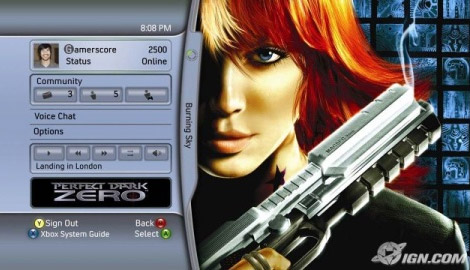
When the Xbox 360 launched in 2005 it launched with a brilliant online environment where you could play with friends, earn achievements from your games, compare these achievements with your friends and have online chats/send messages to other gamers; all this whilst still playing your favourite video game – it was revolutionary:
When the Playstation 3 launched almost one year to the day after the Xbox 360 it was expected that their own dashboard and online experience would better the 360’s experience – it didn’t.
Sony’s dashboard looked great, but interacting with friends was almost impossible, there was no achievements to earn, chat was ropey and you couldn’t do anything whilst in-game – not even chat with friends!, then in 2008 (two years after it was released) Sony brought out an update which added the XMB – a menu accessible whilst in game which, also added achievements to it’s games (now called Trophies), quicker access to messages and the ability to chat to friends whilst playing:
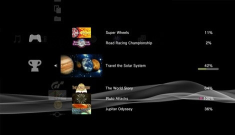
It was late, but late is better than never everyone was saying – me included.
The update brought with it the new gamer card which, i’m writing this post about (sorry it’s taken this long to get here, but it’s worth it, right?), this card became visible when you clicked on one of your friends and with the new Trophy system things got competitive with your friends as you could see who’s online, what Trophies they have achieved and who’s accrued the most Trophies overall; all cool stuff.
The Gamer card also included what you would expect a card to feature, your friends name, an avatar, their online status, a quote and a small bio whether they chose to enter one or not – this information as well as the above information regarding Trophies makes up an oversized gamer card consisting of three separate sections all accessed by using the shoulder buttons of your Playstation 3 controller.
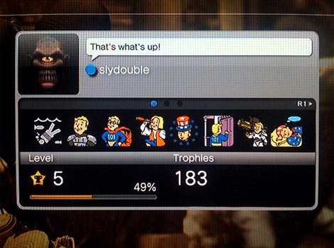
The first slide that you see consists of your Trophy total, your ‘Level’ (which, is based on your total amount of Trophies and how many you have of each type with a progress bar showing you how close you are to ‘levelling up’) and 8 small icons which, represent the latest 8 Trophies you have attained in your games – the problem with these icons is it doesn’t tell you what games they were attained in or how you got the Trophy; a fairly critical piece of information is missing there! I also find that these icons take an age to load and of course once they have loaded, you are still none the wiser as to what they are anyway:
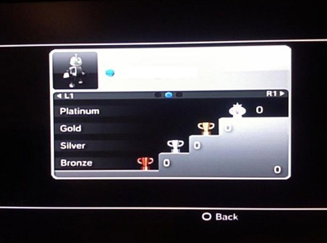
The second slide contains your Trophy information, but now in more detail, it breaks down the total amount of Trophies on the first screen into type’s of Trophy you have (based on difficulty) starting with Bronze (easiest to attain) to Platinum Trophies (for attaining all other types of Trophy on a game) on a rather nice podium stand:
The third and final slide of this hefty gamer card contains your name (again), a bio and a languages section that simply lists your language, which I also guess helps you to work out roughly where a fellow gamer is located:
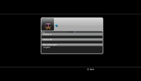
What a waste of space.
My goal with my redesign was to get rid of all these separate slides and all of the unused space and try and place all the necessary information that any gamer would want to know on one screen, without making it look over crowded.
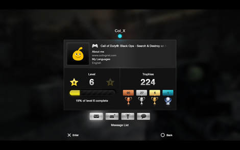
What I came up with was something that I feel adds a new, slick, cleaner design, with more emphasis on whether that gamer is online or offline, what game they are playing (and if they were offline – what game they were playing), I also wanted the trophies (including which, types they have achieved) and the level of that gamer to be prominent on the card.
Along with these changes I wanted to completely scrap the third slide which, had duplicate content on it anyway in the form of your gamer name and only one line of information for both ‘About Me’ and ‘My Languages’ – why not try and get these on one slide too? (Click on the following for full-screen versions)
As you can see, the name and online status is now the focal point, after all they are the most important pieces of information when you’re looking for your friends,
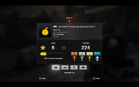
This small variation shows how the gamer card looks when the user is offline, using the current Playstation’s red colour status for appearing offline (instead of blue for online) but now also giving information not only on how long they have appeared offline, but what they played last:
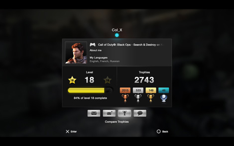
You can also see that now the avatar and bio of the gamer sits together, no duplicate gamer name and with a box wide enough to fit the one line limit of the current XMB gamer card. All of this information is then segmented separately to the nitty, gritty of everyone’s gamer card; the Trophies!
As can be seen in the above screenshot, Trophies are now displayed together instead of split over two slides with both the total and the type of Trophies achieved being displayed. The podium style that is currently on the XMB gamer card has been scrapped as although I felt it looked nice, it takes up way too much space for such little effect.
Speaking of other things being scrapped, other than the gamer name information and trophy totals, the first slide from the original XMB gamer card has been scrapped completely.
The Trophy icons (the latest 8 as mentioned previously) to me were completely pointless being there, they were just icons with no meaning and no information on what game they were from, the new information regarding what game a user was playing before they went offline or what someone is currently playing is much more informative to me.
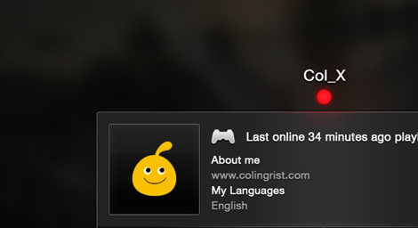
One thing that you may realise is missing is a quote; take a look at the original first slide of the XMB with the users “That’s What’s Up!” speech bubble, I am the only person on my entire friends list who has even bothered to add a quote to my gamer card, so is this feature worth keeping? On one hand if nobody uses it, then no; but on the other hand, it does add a bit of personality to what otherwise is a fairly formal card of information about a gamer.
I’m still working on how I would display this speech bubble, but I think it would work in a similar vein to the current Xbox 360 Motto system which, appears for a few seconds when you first hit the card and then fades away, hopefully I can get this design done, along with a few more variations of the card up for another blog post in the next couple of days!
So what do we think overall then? I’m quite happy with how it turned out and i’m hoping you all think so too!
What do you think – an improvement or a step backwards? Comments welcome! Oh, and if you happen to have any driibbble invites, i’d be loving one of those right now!
